Elizabeth Lennard: Painted Columns and Imaginary New York

March 15th, 2024
By Anna Prudhomme @annaprudhomme
When I enter the studio of photographer Elizabeth Lennard, winter sunlight is illuminating the place. The New York-born artist speaks perfect French and serves me a cup of black tea with some Macaroons while we sit down at her table ready to talk about her 50-year career. After exchanging a few sentences, she promptly gets up and leads me to the back of her apartment where her studio is located.
“This is my messy studio. It is the way it is, I’m sorry”, Elizabeth said half laughing before showing me one of her latest series. A colour-altered photograph of a statue of George Sand. “It’s part of a series of statues I photographed in France printed on metallic paper. It was for a group show about monuments of women that was held in Saint Louis, Missouri, just before Covid - and then they were part of a solo show at Gallerie Pixi - Marie Victoire Poliakoff, in Paris.”
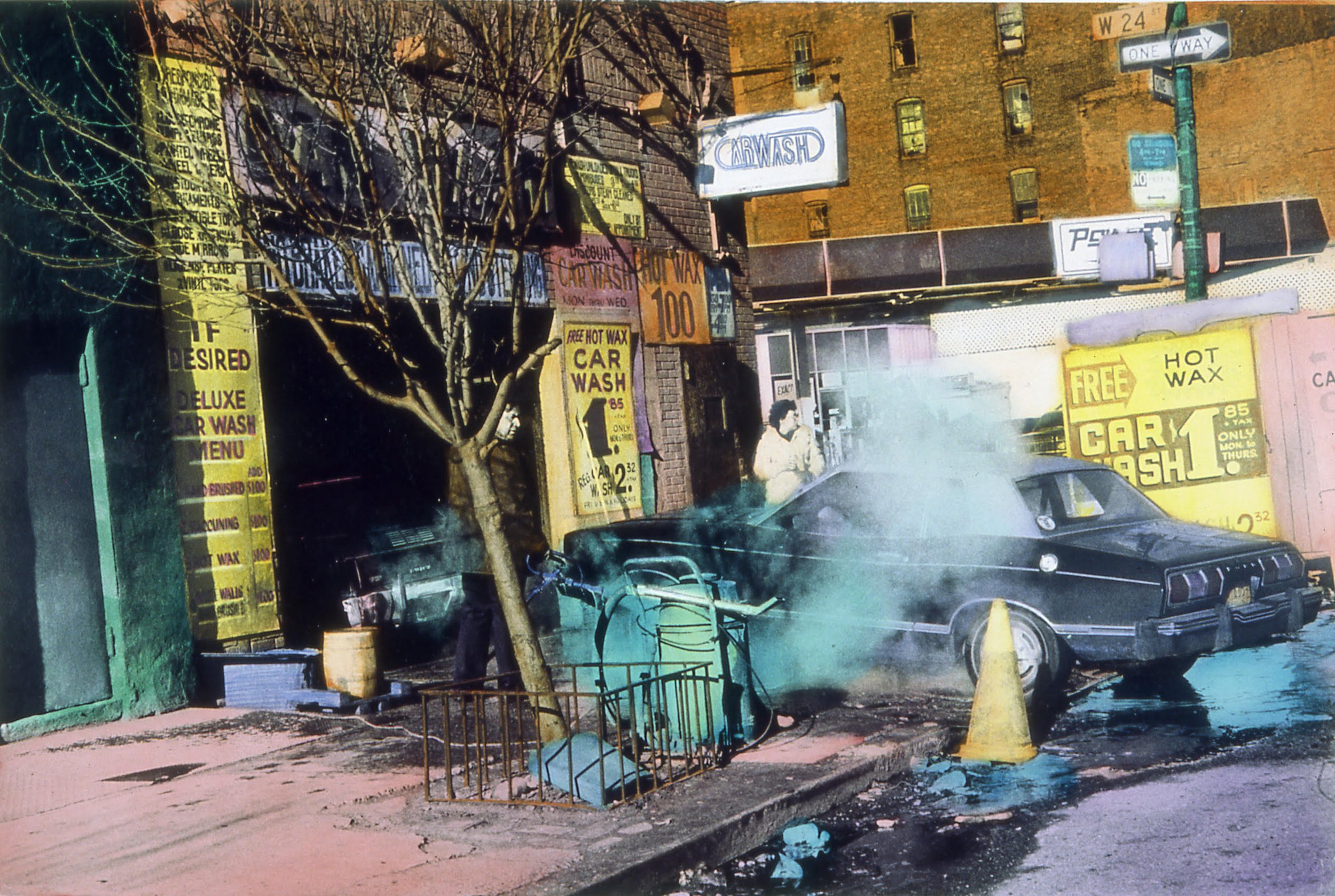
Carwash Menu, ©Elizabeth Lennard hand-colored gelatin silver photograph,varied edition # 4/5, 40cm x 50cm
Anna Prudhomme: How did it first come to your mind to paint your photographs?
Elizabeth Lennard: When I was in my late teens I attended the San Francisco Art Institute in California. It was very much the purist school of black and white photography where you studied Ansel Adams, the zone system, etc … Which I was slightly rebelling against - but as it was an art school, so I wasn't the only one who started to sort of “attack” black and white photographs.
I was very fortunate to have had Tony Ray-Jones as a teacher. He was a great British photographer who unfortunately died very young. But he taught one year at the San Francisco Art Institute and I was lucky to study under him.
Tony Ray-Jones was a photojournalist (people like Martin Parr were influenced by him), so he gave us an assignment to do a reportage. The subject I chose was the Hare Krishna because the movement had just come to San Francisco. Where they were living, there was a giant Indian statue of Krishna that I photographed in black and white, but then I painted the black and white photo and I think that was the beginning of me painting my photographs. In some way, it was an attempt to recreate the colors of the painted statue.
I also loved that painting is a physical act. At art school, I was doing drawing, lithography, etching, and those kinds of studies and I just wanted to bring the two things to the same level.
And so ever since then, I've been painting on my black and white photographs. As they invented Photoshop and all of these other methods, I began experimenting with other methods too.
“It was an art school, so I wasn't the only one who started to sort of “attack” black and white photographs.”
AP: Such as?
She points out large-scale photographs in a lightbox.
EL: I did a series of light boxes - they were originally used for photographers to look at slides, or were used for signs.
To create these I used another method of combining, or assemblage, I enlarged a contact sheet of black and white negatives. Then I applied the color with brush strokes on separate pieces of paper before superimposing them onto the enlarged contact sheet.

“Dogs are good for photography" ©Elizabeth Lennard from the "Gertrude Stein" series. Contact sheet painted in a light box dimensions: 50cm x 60cm Year: 2000
AP: Why did you change up your approach?
EL: I work with diluted oil paint for vibrant colors. Instead of priming the paper, I paint directly on its surface, which accepts the paint without absorbing it.
I prefer applying paint with cotton swabs so I've dubbed myself the “queen of the Q tips”. [She laughs]. My process became even easier with the introduction of pointed Q-tips! But times changed and I evolved with the techniques, too. Also, they stopped production on the large format paper that I needed to paint on… So I had to change my technique!
I must say I never was one to stick to a single approach. When I first experimented with contact sheets, it was a rebellion against the idea of choosing just one image. In photography classes, you're always told to select the best shot, but I wanted to challenge that norm. I wanted to capture the entire process, not just the final result.
“When I first experimented with contact sheets, it was a rebellion against the idea of choosing just one image.”
Nowadays, with iPhones, you can snap a million shots, but you still have to choose one. I didn't want to follow that rule. I wanted to tell a different story with my photos: one where the process of choosing the “decisive moment” was part of the work itself!
I can't quite pinpoint when I started working with an enlarged contact sheet, I think it was the early ‘90s: I took many photographs of ruins, and the art nouveau architecture in Barcelona… focusing on columns which always fascinated me. You see, speaking of the evolution of my technique, these days, I even work with miniature columns!

Temple of Neptune, Paestum (triptych) ©Elizabeth Lennard. - 1990. Color-enhanced gelatine-silver prints 50 x 40 cm (each) 1/5, 2/5, 3/5
AP: What draws you to capturing architectural settings?
EL: I think when I was very young, my parents asked what I wanted to be when I grew up and I said an architect. But then I realized you had to do a lot of math and technical stuff. And so I thought, “Oh, I don't think that's what I want to do. I felt more like being an artist”. But I've always been attracted by buildings and architecture.
One of my series, that has been exhibited a great deal, is of New York City, where I painted cityscapes and skyscrapers in bright colors. In the beginning, the idea was not to make the colors real but to make them in the way I imagined them.
At one time German collectors who had never visited New York saw my work and when they finally came to New York for the first time, they remarked that my painted photos captured the essence of how they had imagined the city. Initially, I wasn't aiming for complete surrealism; rather, I sought to create an alternative reality, or as if it were a highly cinematic scene, where everything is viewed through a blue-tinted lens, for example.
AP: You mentioned earlier the idea of the “decisive moment” in photography, can you tell me more about how you think about it?
EL: I was always told about Cartier-Bresson, the king of black and white photography, and how he emphasized capturing the “decisive moment”. People might get upset with me for saying this, but, it turns out, he did crop some of his photos a tiny bit. So, the idea of a perfect moment isn't always perfect: sometimes there's a stray hair in the frame; when you're enlarging it, it might be slightly crooked so you adjust it a bit… You don’t just make an image fit the paper, but you make sure it looks right. Nowadays, everyone edits their photos on their iPhones.
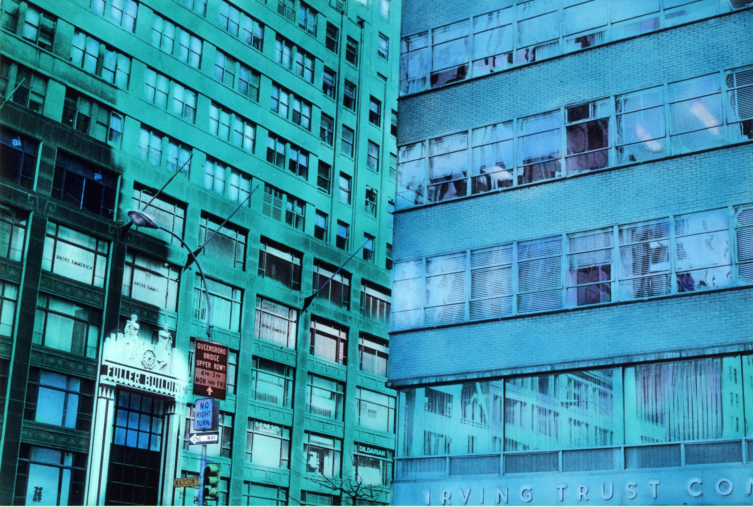
Fuller Building, ©Elizabeth Lennard hand-colored gelatin silver photograph, varied edition# 2/5, 40cm x 50cm
AP: You’ve captured portraits of many remarkable people. Could you walk us through the process of photographing some of them?
EL: So, when I started, there wasn't even MTV. But there was a great deal of cash flowing into the record business, especially in Los Angeles. You could make a decent living doing album covers, and I managed to land some gigs doing just that. Eventually, I was asked to do an album cover for Jean-Jacques Goldman. I was in France at the time, and since they knew I did album covers, the record company sent me to do his portrait for his first solo album. I'd never heard of him, he wasn't famous. But his first solo LP turned out to be a smash hit and he was very pleased with the album cover.
Now, each of my portraits has its own story. There's one taken at the Fun Gallery, on the Lower East Side of New York. Patti Astor and Bill Stelling owned it and were crucial in nurturing budding artists of the downtown scene. I stumbled upon them through a magazine called City Magazine. It's been revived recently, but back then, the founder, Jean-Pascal Billaud invited me to New York to take photographs to accompany his reportage for the new magazine he had created. He had his finger on the pulse of everything and everyone in the city, which led me to do a portrait of the creators of the Fun Gallery who were among the first to show Basquiat and Kenny Scharf.
Before that, I had done work for other magazines. You're familiar with the renowned editor of Vogue, Anna Wintour, right? Well, before her tenure at Vogue, she was the fashion editor of a magazine called Viva in New York. It had a short-lived run, from '73 to ’80.
“There was a great deal of cash flowing into the record business, especially in Los Angeles. You could make a decent living doing album covers, and I managed to land some gigs doing just that.”
Somehow, my sister (also a photographer) and I, managed to convince her that we could go to Cannes and do a reportage for her magazine. But then, well, the magazine folded, and nothing ever came of it. But we did manage to photograph Steven Spielberg. This is ancient history, so “Jaws” hadn't been released yet. It wasn't part of the official selection at Cannes. Spielberg was just there with “Jaws” in the film market. Somehow, my sister and I got to meet him. I can't remember how. And he told us about his movie about a shark that's really big and eats people. And we were like, "Oh, good luck." We were very young at the time, and looking back on it now, it seems rather surreal.
Lately, I've been mulling over something. I've got all these portraits of people like Andy Warhol, Jerry Lewis, Ryuichi Sakamoto, Bianca Jagger, Marguerite Duras… And I'm thinking of putting together a book.
AP: That seems like an amazing idea! I would personally love to see such a book of portraits.
Thank you very much for sharing your insights, Elizabeth. It's been so great learning from you!
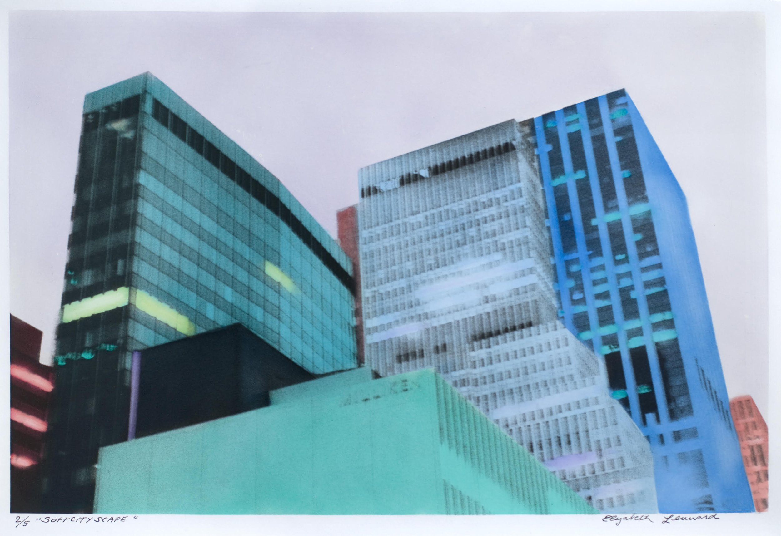
SoftCityscape, ©Elizabeth Lennard hand-colored gelatin silver photograph, varied edition# 2/5, 40cm x 50cm

About Elizabeth Lennard
American multimedia artist Elizabeth Lennard lives and works in Paris and has been altering her black and white photographs since the 1970s. She had a solo show at the Pompidou Center in 1979 and was included in several group shows, the most recent: The Unbearable Lightness, the 1980s, photography, film (2016). In 2009 the video-performance: To make a Cord, collaboration with writer Danielle Memoire was also presented at Pompidou. Lennard's fascination with the built environment inspired her to direct Tokyo Melody: a Film About Ryuichi Sakamoto (1985) and a photographic book on Alexander Chemetoff's Bamboo Garden in Paris (1997). Her performance E-1027 Design for Living: Eileen Gray & Jean Badovici (2015) and the film version “Talking House” were presented internationally and in the 2016-17 MOMA show How should we live, propositions for the Modern Interior. Other venues for her performances and video-objects are the Louvre Museum and Grand Palais and the Chateau de Versailles.Her recent feature length documentary Rosl’s Suitcase premiered at This Human World, Human Rights Festival in Vienna in December.